
☰
TigerPlan is a web app developed to help students plan for academic minors that they want to pursue. During this project, I was the lead UI/UX designer, helping with all steps of the design process.
TL;DR: I have UI/UX, brand development, and front-end web development skills! Check out the full site here.
Explains how user's can navigate the app!
Click to download!
The first step was creating a brand. Most apps created for Princeton students used muted colors and sans serif fonts to look modern and clean. My team felt that those apps felt rather cold and impersonal, and for an app that is about planning your academic journey, we wanted to make our users feel excited and invited. These emotions were the first steps in deciding the look of TigerPlan.
After we knew what we wanted our users to feel, we moved on to picking fonts and colors. The two fonts we chose were Roboto Serif and Caveat Brush. Roboto Serif gave us a feeling of a typewriter, which reminds people that they get to choose how they plan their courseload. Caveat brush reminded us of markers, allowing people to change, mark up, and edit their academic plans as they wish.
The decision to make our logo feature dual fonts encompasses a few ideas. Firstly, it shows the parallel planning that a student can do to achieve everything they want- including more than one minor. By incorporating both fonts that best represented the app, we were able to convey the unique qualities of each, capturing a blend of emotions and characteristics that a single font alone couldn't achieve.
However, this lead to us questioning the accessibility of our logo. Two fonts could make it harder for people to read. We immediately tested it by asking other students what they thought. With alt text and a clearly contrasted background, our testers really liked it!

TigerPlan Logo
Next was the color scheme. First, we randomly generated colors since we did not have a great idea of how to make our app fit within the existing Princeton student apps but also differentiating it from the rest. Already, there was a risk with the logo and fonts not fitting the sans serif themes of other apps, so if the rest of the app looked too different, it would be hard for students to understand that this is for them specifically. With this in mind, we made sure to include orange in the color scheme to fit Princeton University's colors.
Our next idea was to have a second color, which would fit with the duality seen in our logo. We selected a calming shade of blue that evoked a sense of focus and tranquility. After that, we chose two adjacent colors for emphasis, hyperlinks, etc. and one neutral yellow.

TigerPlan Color Palette
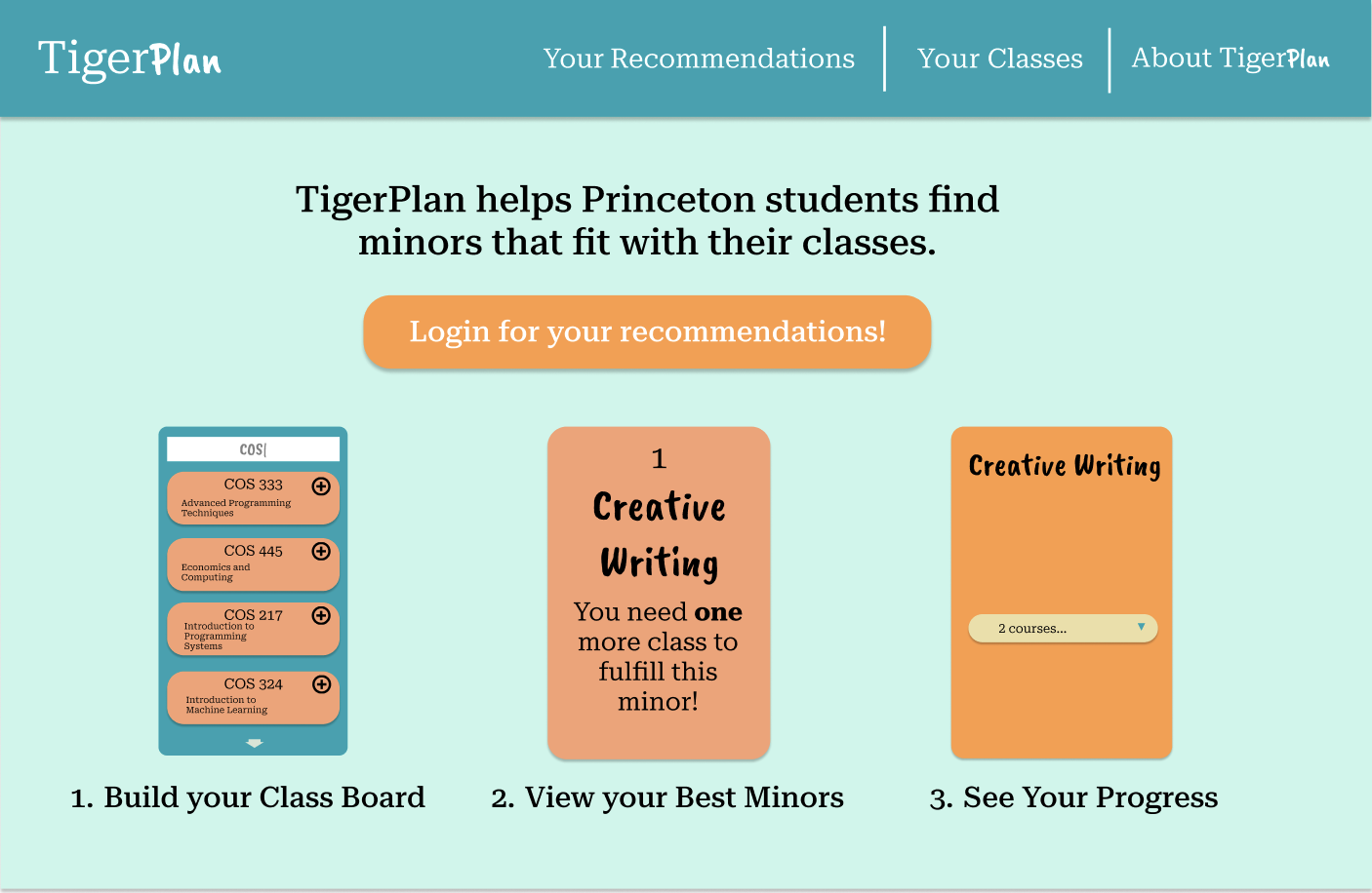
To build a mockup of the site, we used Figma. The design of the site was inspired by a deck of cards, with the cards being the various minors you can attain. Part of the functionality of the site is that the user can input classes that they have already taken and an algorithm we designed would recommend which minor they are closest to achieving. This goes hand-in-hand (no pun intended) with the deck of cards, since the user will visually see their progress and course options, making the process of selecting a minor more interactive and intuitive.
We used quite a few tools to make this possible. For the backend, we used Flask to set up a lightweight web server and manage the application’s routes. We utilized Flask’s render templates to dynamically generate HTML pages based on user interactions and data retrieved from the server. On the front end, AJAX was used to asynchronously send and receive data from the server without requiring a full page reload, creating a smoother user experience. We used JavaScript extensively to handle client-side interactions, including form validations and updating the UI based on user actions. To store and manage our data, we used MongoDB, a NoSQL database that allowed us to efficiently handle JSON-like documents, providing a flexible schema that adapted well to our needs. Together, these tools helped us create a robust and dynamic web application.
To efficiently manage and store the requirements for achieving academic minors, we utilized a tree structure within MongoDB. Each minor was represented as a root node, with branches representing different categories of requirements, such as core courses, electives, and prerequisites. These branches further broke down into leaf nodes, detailing individual courses or specific conditions needed to fulfill each category. This hierarchical structure allowed us to clearly define the pathway a student needs to follow to complete a minor, accommodating the complexity of different combinations and prerequisites. By using this tree structure, we could easily query the database to check for completion of specific branches or leaves, providing users with accurate and personalized recommendations based on their academic progress.
Figma Mockup
The website ended being very useful to Princeton's underclassmen, who use it when they are unsure what minors they can achieve with the current courses they've already taken. We use Princeton's Central Authentication System (CAS) to store each users information with their student netID. This means that users do not have to manually input their courses each time they log into the site. My team plans on working together throughout this academic year to provide more updates to the web app!
To visit the site, click here!
If you are not a Princeton student, take a look at the screenshots below! (It will autoscroll!)
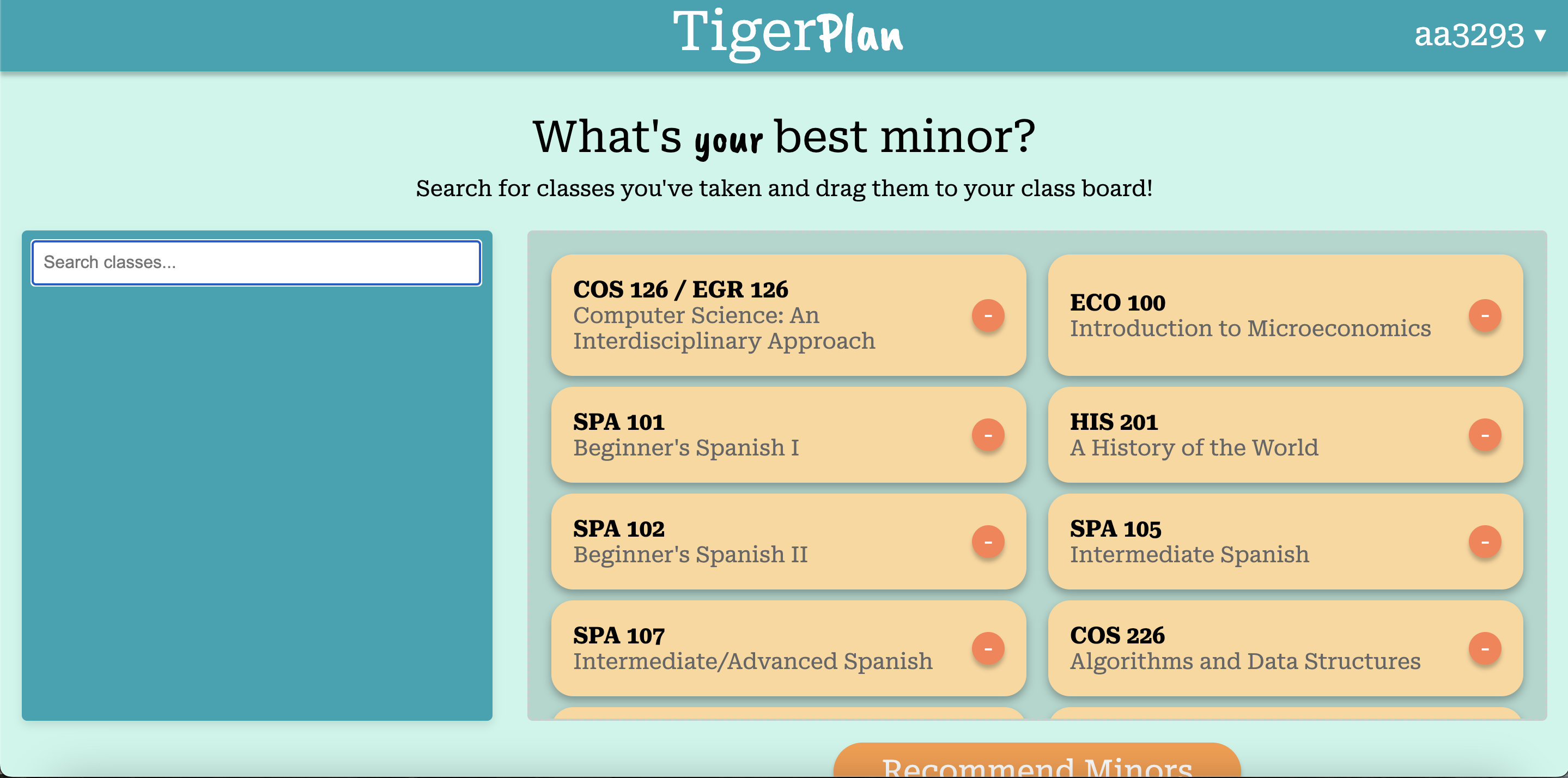
Classboard
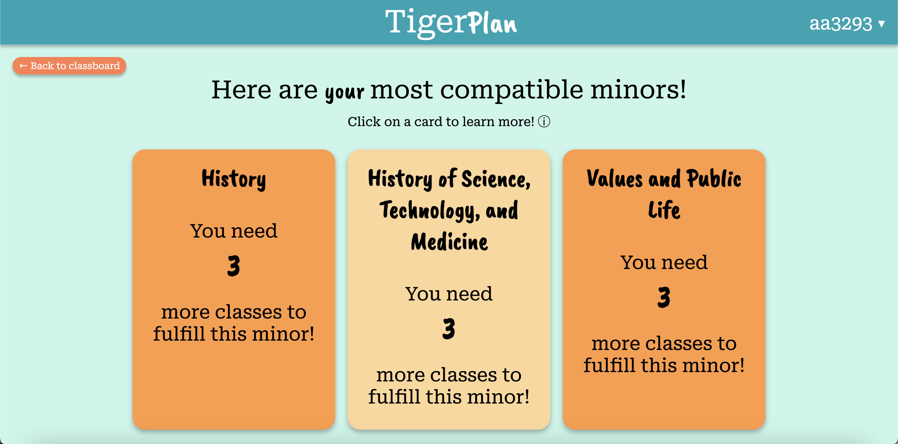
Recommendations Page

Expansion of Minor Card
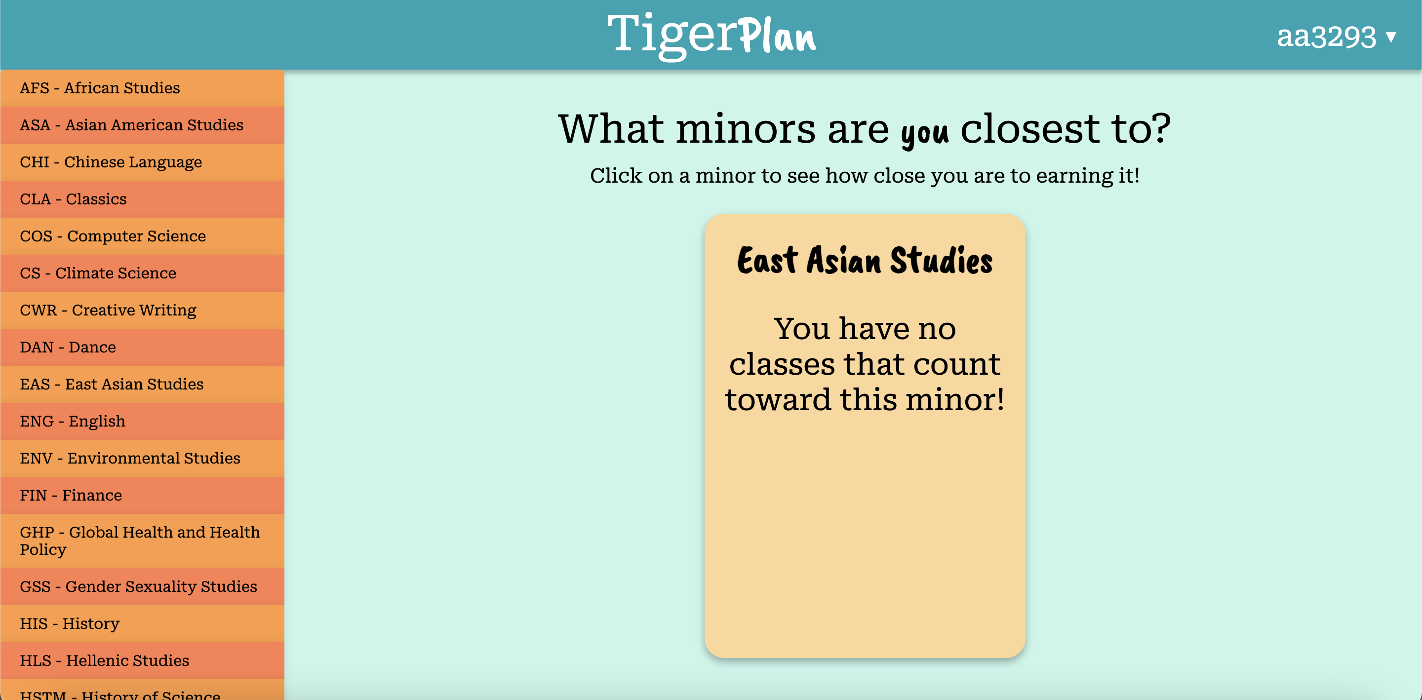
All Minors Page
Special thank you to Josh Schoenberg, Tara Shukla, and Samyukta Neeraj for being the best team I've ever worked with. Thank you to Creston Brooks and Professor Robert Dondero for advising us through this project.